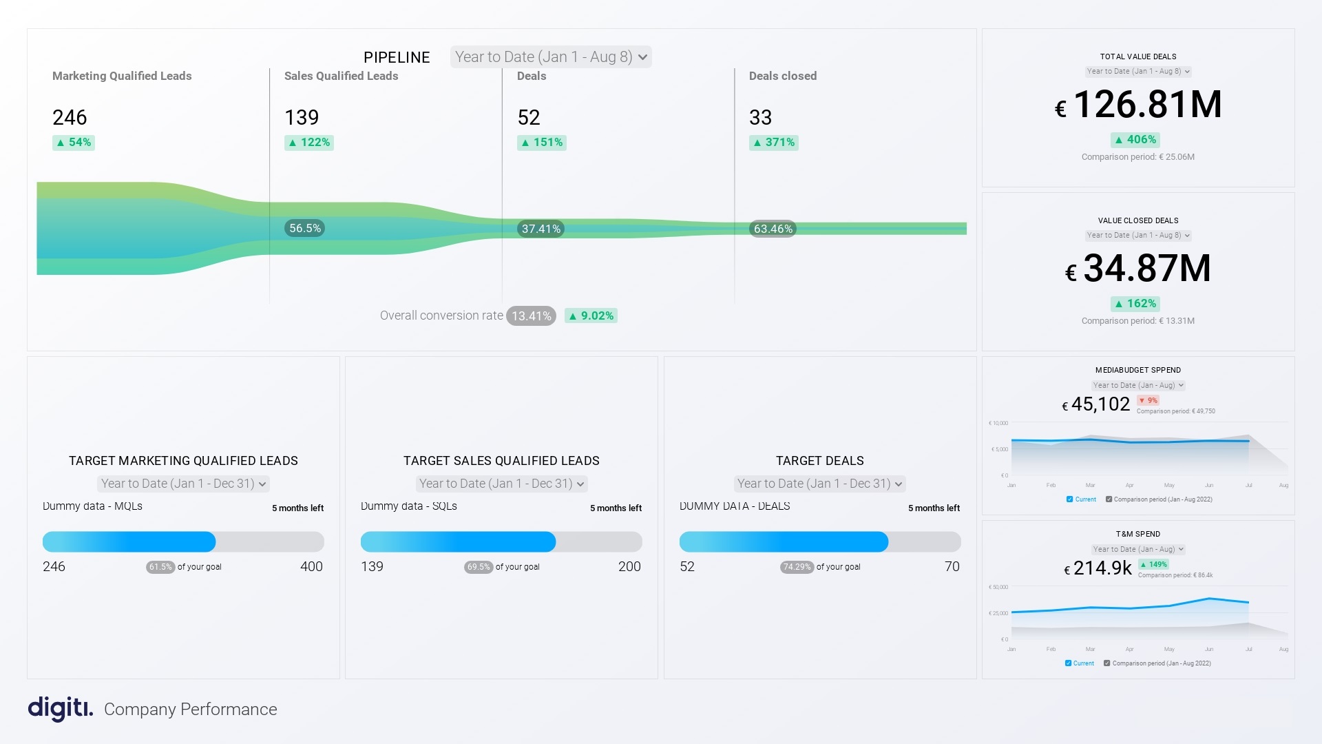
What are marketing and sales dashboards?
Think of a cockpit of a plane. A marketing and sales dashboard is similar, providing a bird's eye view of your business’s critical metrics. This visual tool displays data using charts, graphs, and tables, capturing metrics like site visits, lead conversions, and finalized sales.
Why are they important?
Track progress: Dashboards offer a time-lapse view of your business metrics. This temporal view can unearth patterns and guide recalibrations in strategy.
Spot improvement areas: Pitting your performance against industry standards, dashboards reveal strengths and areas needing attention.
Make informed decisions: Clarity in performance data equips businesses to make grounded and decisive moves, maximizing resource utilization and ROI.
How to create a marketing and sales dashboard
There are several different ways to create a marketing and sales dashboard. You can use a third-party software platform, such as Google Analytics or Salesforce, or you can build your own dashboard from scratch using a spreadsheet or data visualization tool like Databox.
If you're using a third-party software platform, you'll need to select the metrics you want to track. You can then customize your dashboard to fit your specific needs.
If you're building your own dashboard, you'll need to collect the data you want to track. You can then use a data visualization tool to create charts and graphs that will help you track your progress.
Choosing the right data visualization tool
Visualizing your data is only as effective as the tool you're using. But with so many data visualization tools available, how do you choose the right one for your needs? Here are some guiding principles:
1. Align with your needs and business goals
Before diving in, understand what you need. Do you need direct connectivity to certain data sources? A abundance of chart varieties? Or perhaps, a user-friendly interface that even the least tech-savvy person on your team can navigate? List down your must-haves.
2. Be budget-savvy
Data visualization tools come at all price points. While some are free, others might set you back a hefty sum. Striking a balance between your budget and the tool's offerings is crucial.
3. Dive into reviews
In today's digital age, reviews are gold. Spend some time browsing through user feedback on your shortlisted tools. This helps gauge real-world pros and cons.
4. Test the waters
A majority of data visualization platforms offer trial periods. Make the most of them! Experiment, play around, and understand the tool's ins and outs before committing.
Factors to keep in mind: when choosing a tool
Data sources: It's important that the tool seamlessly integrates with the data sources your business uses.
Chart diversity: Depending on your presentation needs, you might want a tool that has a wide variety of charting options.
Customization: A tool that allows you to tweak your visuals, ensuring brand consistency and tailored communication, can be a blessing.
Collaboration: Sharing and collaborating on visualizations, especially in large teams, is often essential.
User-friendly: An intuitive tool can drastically reduce the learning curve and foster faster adoption across teams.
Support system: Reliable customer support can be a lifesaver when you encounter a roadblock.
By taking the time to assess these parameters, you can ensure your chosen data visualization tool is not only efficient but also tailored to your business needs.
Dos and don'ts for using marketing and sales dashboards
Once you've developed your marketing and sales dashboard, it's not just about having it - it's about approaching it strategically. Here are some dos and don'ts to ensure you're on the right track:
Do #1: Stay focused on your business
Your dashboard should reflect your business goals. Prioritize and be specific. If, for instance, you aim to maintain optimal inventory for top products, design your dashboard around that.
Don't: Steer clear from making your dashboard merely an aesthetic tool. It should be functional and focused on business-critical data.
Do #2: Utilize the power of KPIs
Embrace Key Performance Indicators. They give a quick health check of crucial metrics. Having clear indicators, like green for optimal stock levels and red for attention, can be invaluable.
Don't: A flood of KPIs can reduce focus. Remember, the "K" stands for key. Prioritize and keep it simple.
Do #3: Make it actionable
A dashboard should not just inform but should also inspire action. If a KPI is in the red, users should know the next steps to correct the course.
Don't: While knowledge is power, a dashboard should push for action, not just passive awareness. Ensure it promotes decision-making.
Do #4: Democratize access
Every decision-maker, regardless of their position, should have access to a relevant dashboard. It encourages informed decisions at all levels.
Don't: Avoid bottleneck dashboard access. Be careful with limited user licenses, too. Opt for scalable, inclusive solutions.
Leverage dashboards for business growth
In conclusion, marketing and sales dashboards aren't just tools – they're compasses pointing businesses towards growth. By consistently tracking, analyzing, and responding to these insights, businesses are better equipped to navigate the complex waters of the market and set sail towards success.